
Design
Is your website readable?

We spend so much time and energy creating great content—so let’s make sure it’s easy for people to enjoy it!
Improving readability is one of my biggest priorities as a web designer. I honestly believe people do read online content, as long as we make it easy for them. Here are my top tips for improving readability so your website works better for your audience and your business.
Why Readability Matters
- It makes your website look professional: A clear, organized site leaves a great first impression and builds trust.
- It lowers bounce rates: When visitors aren’t immediately overwhelmed by messy layouts or walls of text, they’re more likely to stay.
- It keeps people on your site longer: When content is easy to read, people stick around. That extra time on the page is a big win.
- It helps with SEO: All these improvements tell Google that your site is user-friendly, which can help boost your ranking.
So, it’s not just about making things look nice—readability plays a big role in how your website performs.
Tips for Standard Web Pages
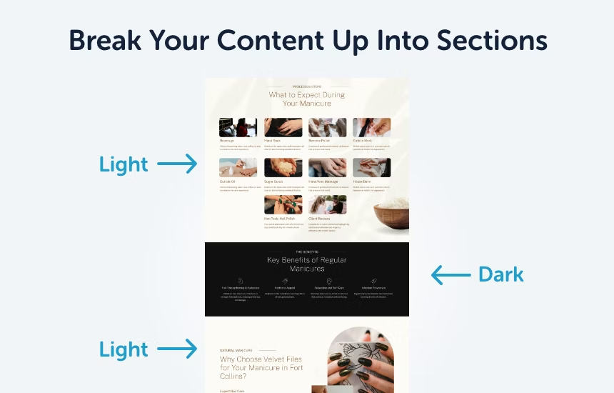
1. Break Content into Sections
Think of each section as its own mini-story. Your H2s should guide the reader by breaking your content into topics that are easy to skim.
- Use background colors: This is one of my favorite tricks! Alternate between darker backgrounds with white text, light-colored backgrounds, and plain white to visually separate sections. It keeps things interesting and makes your site look super polished.
- Add padding to sections: Each section should have some breathing room. Adding 50px of padding on the top and bottom is my go-to—it’s simple but effective.
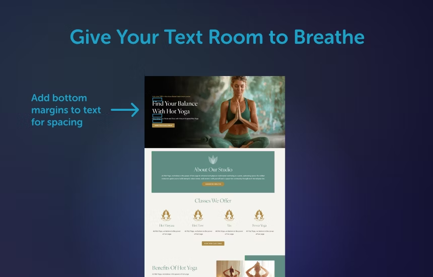
2. Give Your Text Room to Breathe
Text needs space to stand out, so don’t cram everything together!
- Use margins: Headlines, body copy, and CTAs shouldn’t be so close they’re touching. Give each element some space (I usually go with a 25px margin at the bottom). Consistent spacing throughout your site gives it that professional, polished vibe.
- Line height matters: Adjust the space between lines of text so it’s easy to follow. A good rule of thumb is to set line height to 150% of your font size (e.g., a 16px font would need a 24px line height).
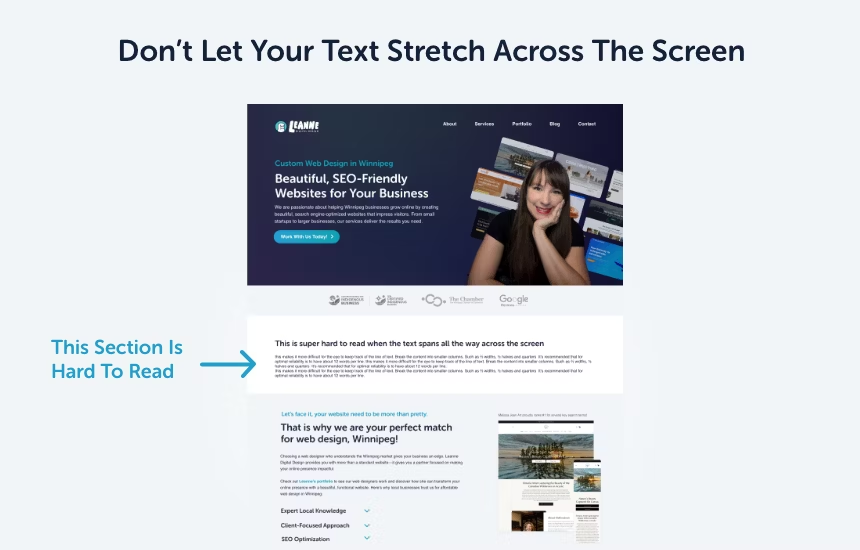
3. Don’t Let Your Text Stretch Across the Screen
Have you ever tried to read something that spans the entire width of a screen? It’s the worst!
- Keep lines short: Break content into columns that are ⅔ or ½ the page width. Ideally, aim for about 12 words per line. This makes it much easier for people to stay focused while reading.
4. Choose Readable Fonts
Playful fonts can add personality, but they’re best kept to headlines. When it comes to body text, stick with simple, easy-to-read fonts that don’t strain the eyes.
5. Use Strong Color Contrast
Contrast is key for making text stand out and easy to read, especially for people with visual impairments or when viewing your site on mobile devices.
- Text vs. Background: Make sure there’s enough contrast between your text and its background. For example, light gray text on a white background or yellow text on a light background is a no-go. Black text on white, or white text on a dark background, works much better.
- Highlight with Color: Use high-contrast colors to make important elements like CTAs or headlines pop without being overwhelming.
Check your color contrast using this website: https://coolors.co/contrast-checker
Strong contrast isn’t just about looks—it ensures everyone can read your content easily, no matter their device or environment.
Blog-Specific Tips
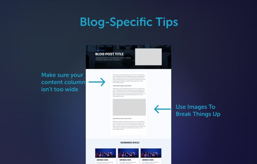
1. Narrow the Content Column
A common mistake with blogs is letting the line of text stretch too wide. I suggest max-width of 900px for your text column to keep it easy to read.
2. Use Images to Break Things Up
Images aren’t just pretty—they’re a great way to give readers a mental break and help explain what the content is about. Plus, they make your page more fun to look at!
3. Break Up Long Paragraphs
Big blocks of text can feel overwhelming. Instead, break them into smaller chunks or use bullet points to make your content easier to scan.
By focusing on readability, you’re not just improving how your website looks—you’re making it more useful, welcoming, and effective. Your visitors will thank you, and so will your analytics!